Within my Fashion Communication and Promotion course, we have been looking through magazines and trying to analyse and interpret advertisements which I found so interesting to do especially step by step. We had to do a semiotic analysis step by step when evaluating this advert.
The first magazine, I looked through was ‘Elle’. This is a magazine that I am really familiar with as I love looking through and reading about the latest trends and stories from designers to see how they got started in the industry. (Which hopefully one day I can follow!)


This is ‘Aigle’ logo
I started to analyse the ‘Aigle’ advertisement who are a leading manufacturer of rubber footwear and fashion. I personally haven’t shopped here before but I found their ads really intriguing and exciting to look at.
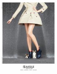
This ad is titled ‘Kittens 2’
When I first saw this, I started off by thinking about all the products and objects as well as the background and colours within this image.
I thought that this was a simple image that captures exactly what is trying to be sold.
The different elements of this advert creates this image:
- Rain – this conveys a dark scenery and the dark grey background creates a wintery feel.
- Trench coat – this shows its seasonal which is winter time.
- Body from shoulder downwards– this creates a bigger effect as it shows the products off clearer whereas the models face doesn’t need to be in the photo to display the products being advertised.
- Posture – by the women having a bent posture, it allows the kittens to be protected from the rain.
- Kittens – makes a big difference to the advert as it shows cuteness. Also the shape of the coat and boots are protecting them from getting wet.
- Boots – this is the product being advertised, by the model not wearing anything on her legs shows the boots off clearly.
- Writing – the writing allows readers to know what product is being sold as well as where they are made. The number and email address is also written down for readers who want to purchase this product.
- Logo – the brand name and logo is clearly stated underneath the advert for people to know what brand the products are from.
I have broken down the denotation and connotation of this advert to simplify what the image is showing.
I took my analysis further by finding out more information about this magazine advert:
- Aigle has manufactured rubber boots since 1967.
- This advert was produced to create a unique vintage stylish look to allow consumers to follow the latest fashion and stay trendy even in the rain.
- The advertising agency is located in France.
- The creative director for this ad is Florence Bellisson
- The art director was Valeria Chidlovsky
- This advert was released in March 2014.
I really liked this campaign and thought it stood out to me because it wasn’t the same as all the other brands adverts in this magazine.
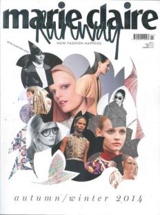
The other magazine that don’t normally look through was ‘Marie Claire Runway’. The one advert that really stood out to me was from ‘Missoni’.

Missoni image in Marie Claire Runway magazine
I thought this was really interesting to look at as there was a lot of subject in the composition.
The visual elements of this advert:
- 2 page print advert – this shows it’s a well-known brand that wants to portray a different look to other brands.
- Unusual materials and objects – these materials and objects throughout the campaign shows it is trying to create a person looking at the model with the Missoni bag. Along with this there are different cuts, textures, patterns and shapes used by the materials.
- Shapes – this gives the image structure and defines the details.
- Clothing – the model is wearing a think sleeveless dress with tights, boots and gloves showing it’s a fall/winter look.
- Logo – at the bottom of the page has the Missoni logo and website to show consumers where to buy the product from.
- Colours –The colour blocking that is used contrasts against the neutral background. As well as this the colours that the model is wearing blends in with the product that is trying to be sold.
After further analysing, I found out more information about this advert:
- The target market for Missoni is 20-30 year olds.
- This campaign was for the 2014-15 fall/winter season.
- This advert plays between memory and future, also between art and science-fiction.
- Joan smalls who is the model in this ad is against the background of an archaeological site.
- The pieces of clothing from Missoni are covering the robot with different shapes, cuts, textures and patterns.
- The different shapes and colours improve the individuality of the Missoni woman and tries to change her into an exciting character for a future cartoon.
- The Creative Director for this shoot was Angela Missoni.
- The photographer that shot this was Viviane Sassen.
I visually loved this campaign as it was different and really got me to think what was happening in this advert. This advert got me to go onto their website and look at the products they sell, as I went on their website I thought this was successful as the campaign seemed to work.


